Physicks supports three breakpoints — Desktop, Tablet, and Mobile — and lets you design completely different layouts for each. This guide explains how the system works, when to use it, and how to design experiences that look great on every screen.
How responsive works in Physicks

Most responsive systems force you to choose between two extremes: either everything is automatically scaled (and looks awkward on small screens) or you have to rebuild your design from scratch for each breakpoint.
Physicks uses a different approach: a cascading system with overrides.
- Desktop is the base. Everything you design starts here.
- Tablet inherits from Desktop. By default, the tablet layout is identical to desktop. You only define what’s different.
- Mobile inherits from Tablet. By default, mobile mirrors tablet (which mirrors desktop). Again, you only override what changes.
This means you don’t redesign your composition three times. You design it once for desktop, then refine it where it matters for smaller screens.
Switching between views
In the top toolbar of the editor, you’ll see three buttons: Desktop, Tablet, and Mobile. Click any of them to switch the editor to that breakpoint.
The currently active view determines:
- The dimensions of the canvas you see.
- Which version of each object’s properties is being edited.
- What overrides will be applied when you make a change.
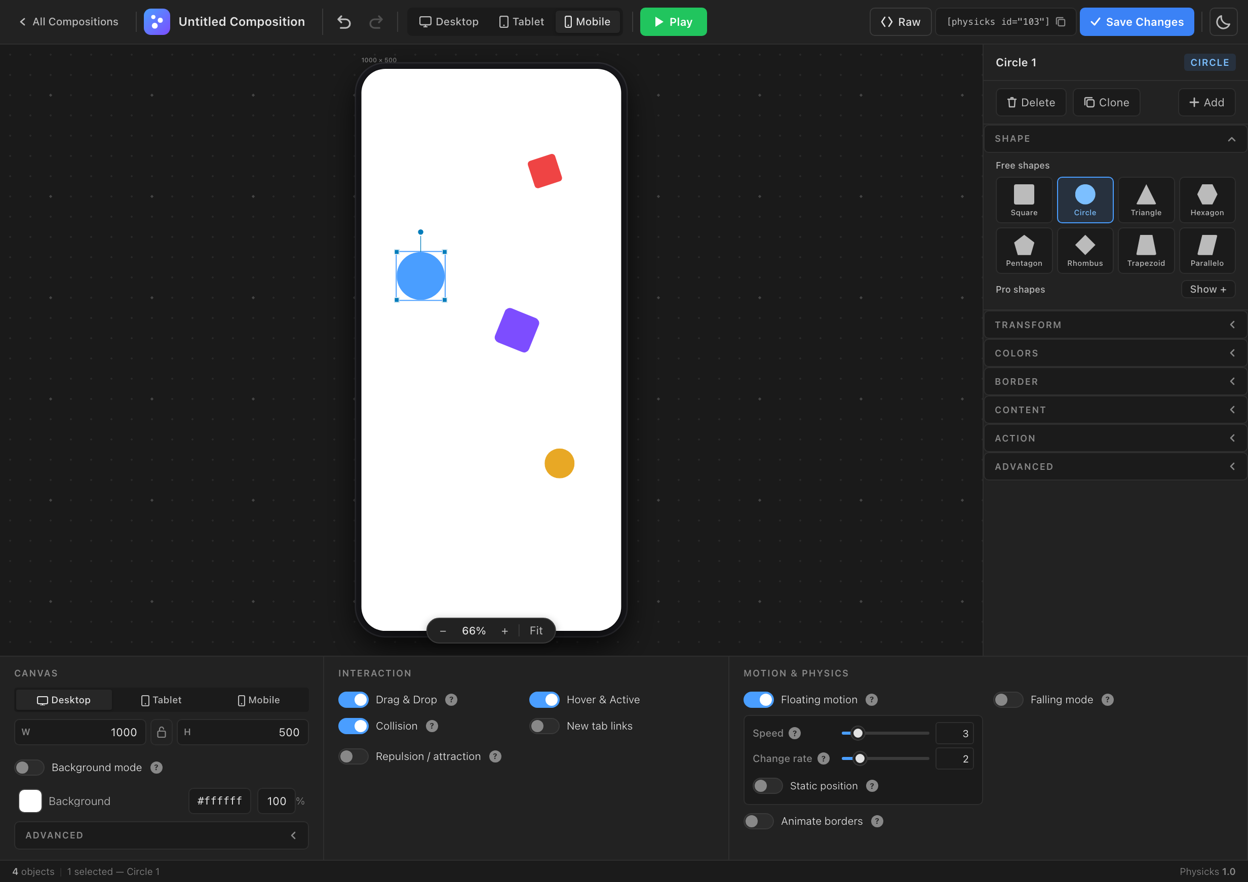
Mobile view
Overriding properties
When you edit a property in Tablet or Mobile view, that property becomes an override for that breakpoint. The original Desktop value remains untouched.
For example:
- In Desktop view, an object is at position (100, 50) with a blue background.
- You switch to Tablet view and move the object to (200, 100). Tablet now has an override on the position. The background still inherits from Desktop (blue).
- You switch to Mobile view. The object appears at (200, 100) — inherited from Tablet — with the same blue background.
- You change the background to red in Mobile. Now Mobile has an override on the background. Desktop remains blue, Tablet inherits blue from Desktop, and Mobile shows red.
This is the cascade in action: every breakpoint inherits from its parent unless you explicitly override.
Visual indicators
When you’re in Tablet or Mobile view, properties in the right sidebar indicate their state visually:
- Inherited properties appear slightly dimmed, with an indicator showing the value comes from the parent breakpoint.
- Overridden properties appear with normal styling and a small reset button next to the control.
Click the reset button to remove the override and return to inherited behavior.
What can be overridden
The following properties can be overridden per breakpoint:
- All object properties in the right sidebar: shape, transform (size, position, rotation, padding, radius), colors, borders, content, action, advanced settings.
- Canvas dimensions for each breakpoint (width and height).
The following are global — they apply to the entire composition regardless of breakpoint:
- All physics settings: gravity, bounce, friction, collisions, falling mode, etc.
- All interaction settings: drag and drop, cursor repulsion, lock bounds, etc.
- All motion settings: floating motion, border animation. Note: floating motion sub-controls and border animation require Physicks Pro.
This separation is intentional. Object properties are about presentation and adapt to the device. Physics settings define the identity of your composition — they should feel the same on every screen.
Configuring breakpoints
Each composition can have its own breakpoint thresholds. Configure them in the bottom panel of the editor under the Canvas group.
The defaults are:
- Mobile: viewport width below 768px.
- Tablet: viewport width between 768px and 1024px.
- Desktop: viewport width above 1024px.
You can adjust these per composition if your design needs different cutoffs. For example, if your tablet design works well up to 1200px, set the Tablet breakpoint to 1200px.
Canvas dimensions per breakpoint
Each breakpoint has its own canvas dimensions:
- Desktop: typically 1200×600, 1000×500, or whatever fits your design.
- Tablet: often a square or moderate landscape, e.g., 800×600.
- Mobile: usually a portrait orientation, e.g., 400×600 or 375×500.
When the visitor’s screen matches a breakpoint, Physicks loads that breakpoint’s canvas size and positions all objects accordingly. The canvas itself scales to fit its container, preserving the aspect ratio.
Practical workflow
Here’s a recommended workflow for designing a responsive composition:
- Start in Desktop view. Build your composition fully — objects, colors, sizes, layout. Get it looking great on desktop before touching anything else.
- Switch to Tablet view. Look at how it appears. In most cases, you only need minor adjustments: maybe smaller text, fewer objects, or a tighter layout. Override only what doesn’t work.
- Switch to Mobile view. Mobile usually requires more changes — different orientation, fewer objects, larger touch targets, simpler composition. Override aggressively here, but remember that everything you don’t override inherits from Tablet.
- Test all three by clicking Play in each view to see how the physics behave with each layout.
Common patterns
Hide objects on smaller screens
Currently, you can’t fully hide an object on a specific breakpoint, but you can effectively achieve this by:
- Moving the object outside the canvas (negative coordinates), so it doesn’t appear visually.
- Setting its opacity to 0 in Colors.
- Making it very small (1×1 pixels).
We’re considering a proper “hide on breakpoint” toggle for a future release.
Adjust object density
A composition with 20 objects on desktop might feel cluttered on mobile. The cascade system doesn’t let you remove objects per breakpoint, but you can simulate it by hiding them with the techniques above.
Reposition for orientation
Desktop is typically landscape, mobile is typically portrait. Plan your composition with this in mind. A horizontally scattered layout on desktop probably needs to be rearranged vertically on mobile — that’s exactly what overrides are for.
Frontend behavior

Composition adapts in real time if the visitor resizes their browser window across a breakpoint.
When a visitor loads a page with a composition, Physicks detects their viewport width and applies the corresponding breakpoint:
- Below the Mobile threshold → Mobile layout (with all overrides applied on top of Tablet, on top of Desktop).
- Between Mobile and Tablet thresholds → Tablet layout (with Tablet overrides on top of Desktop).
- Above the Tablet threshold → Desktop layout.
If the visitor resizes their browser window across a breakpoint threshold, the composition adapts in real time.
Tips
- Don’t override what you don’t need to. The power of the cascade is that you can change just one or two properties per breakpoint and keep everything else consistent. Resist the temptation to redefine everything.
- Use Tablet sparingly. In practice, most projects only need Desktop and Mobile. Tablet often inherits perfectly from Desktop without changes. Don’t feel obligated to design a unique Tablet view if Desktop already looks good there.
- Test with real devices. Resizing a browser window is a good first check, but always test compositions on actual phones and tablets before publishing — the touch interactions feel different from mouse hover.
- Plan canvas dimensions early. Changing the canvas dimensions of a breakpoint after you’ve positioned all the objects requires repositioning. Pick your dimensions first, then design.
Embedding Compositions
← Previous
Embedding Compositions